
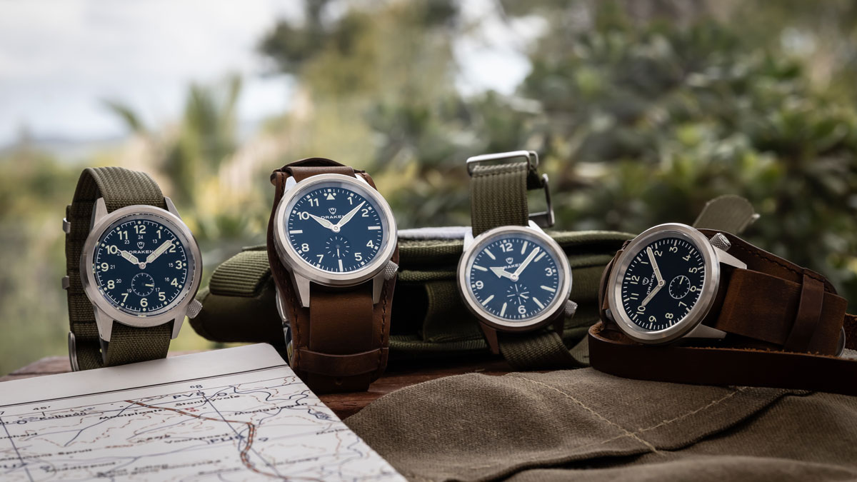
When we designed the Aoraki, we wanted to make a field watch that stood out from the masses. Convention was to use a stacked 3-hander, the most typical layout for a watch. When I searched deeper for inspiration, I stumbled upon the ‘Dirty Dozen’ watches.
If you don’t know about the ‘Dirty Dozen’, these watches were commissioned by the MoD (Ministry of Defence) for British forces during WWII. The criteria for the watch were as follows: black dial, luminous hour and minute hands, luminous hour markers, a railroad minute track, shatterproof-crystal stainless-steel case. They needed to be accurate, reliable and tough, so water resistance was also essential.
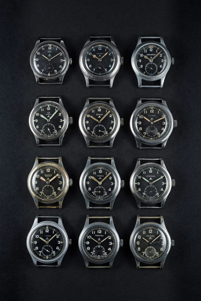
Since British watchmakers at the time were concerned with making parts for the British Air Force and Navy, MoD decided to outsource to Switzerland. Twelve companies responded to the tender: Buren, Cyma, Eterna, Grana, Jaeger-LeCoultre, Lemania, Longines, IWC, Omega, Record, Timor, and Vertex with varying numbers from each company. A total of 150,000 wrist watches were thus produced and issued to special units of the British forces. You can learn more about the ‘Dirty Dozen’ watches in this fantastic article from Hodinkee.
I fell in love with the idea of a small seconds sub dial. After launching the Kruger chronograph the year before, I also saw this as an opportunity to continue some of the dial design language here, using similar treatment to the Kruger’s running seconds sub dial.
One Watch, Four Designs
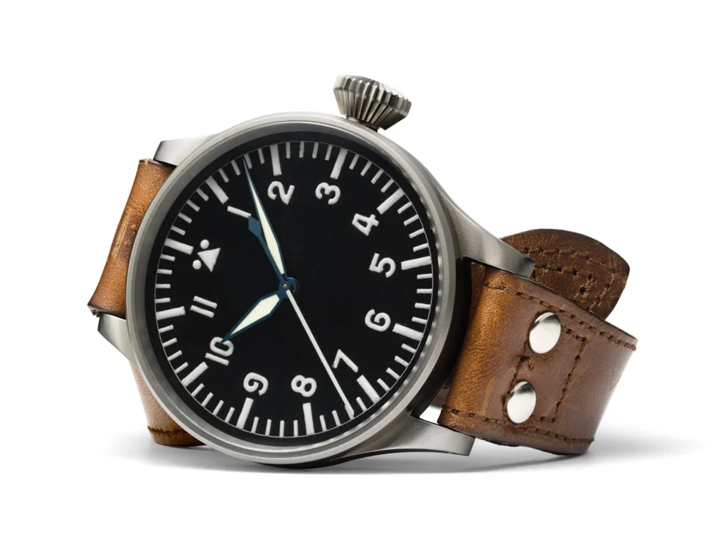
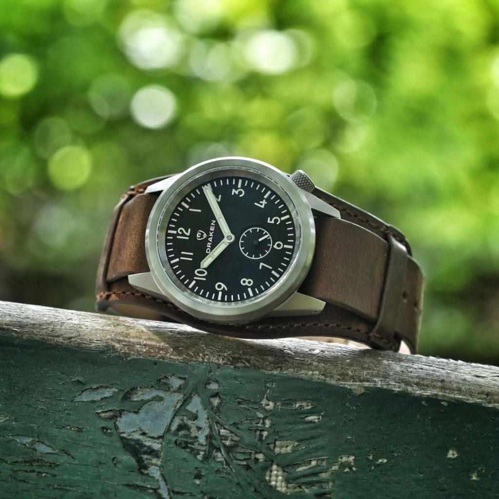
I have always been a fan of the sword hands of the type-A Flieger, so that was the starting point for the Aoraki. A ‘Flieger’ was the nickname given to the style of watch made for German aviators in the 1930’s. Read here for more info about the ‘Flieger’. Using the same sans-serif font from the Kruger, I designed a modern field watch with Flieger DNA. Because the sub-dial at 6 o’clock impeded on the 6h Arabic numeral, I decided to use a baton here as well as the 3 and 9 positions, much in the same style as the IWC Mark XVII.
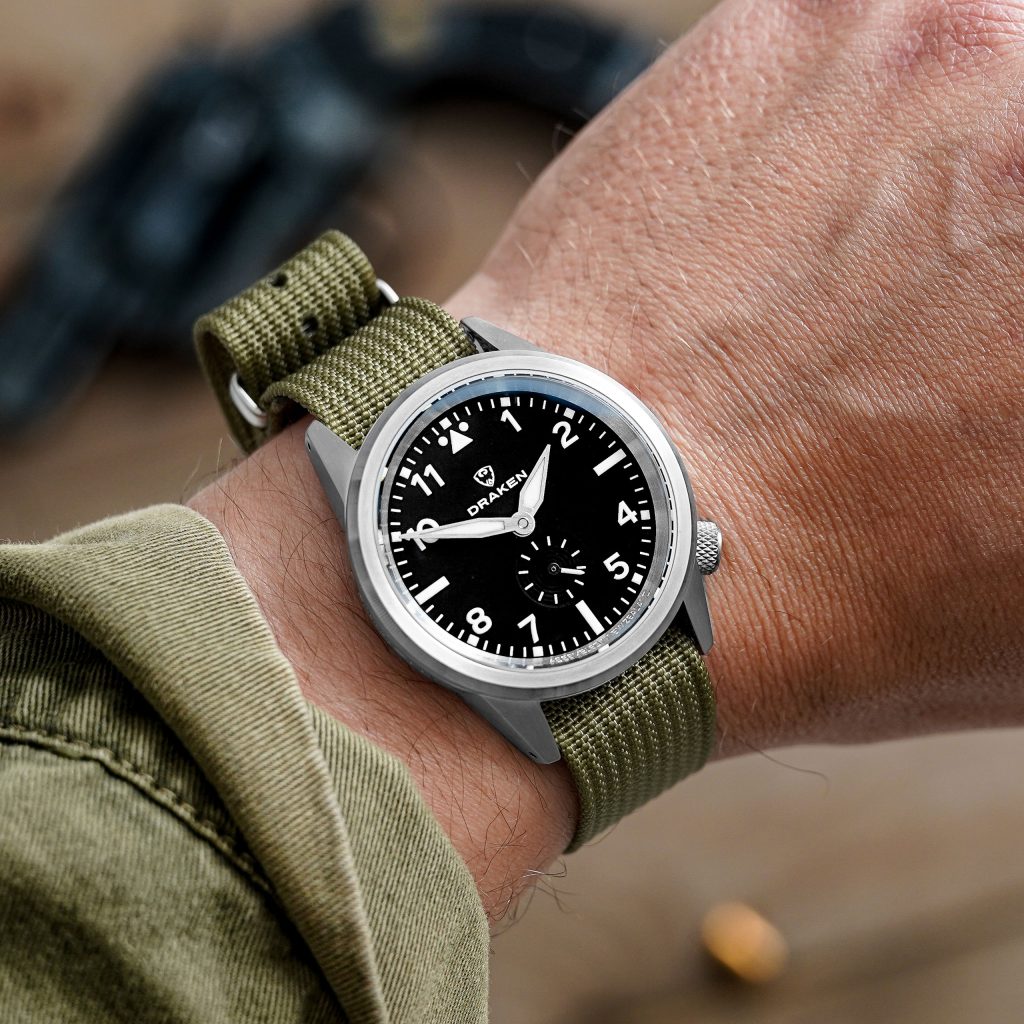
Playing some more with dial concepts, I came up with an arrow handset and Explorer-style design that was reminiscent of the Tudor Ranger, but a bit more angular, more streamlined. It was bold and the handset provided plenty of real estate for luminescent application. This was to become the Aoraki ‘Vector’.
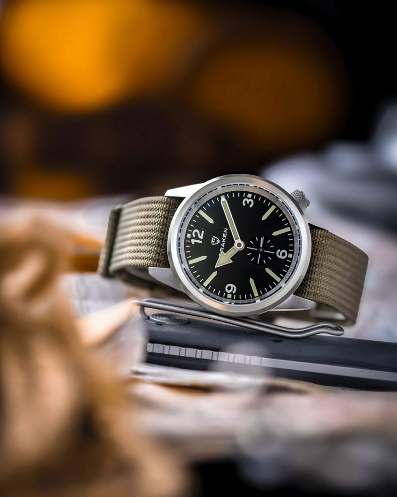
At this point, I was torn. I liked both designs equally and didn’t want to give up on one or the other. I had gone in with the idea that there would be one dial design, and 4 different colours. But what if we did four different dial designs and only did black as a base? This would align well with the high contrast principle of the ‘Dirty Dozen’ field watch.
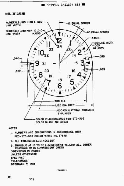
I kept going and looked for other field watch inspirations. The Hamilton Khaki field watch had to be there. The Khaki design stems from a US Department of Defence specification issued in 1962, MIL-W-3818B. Originally created by US company Benrus and issued to soldiers during the Vietnam war, Hamilton later took this design mainstream. We sourced some stock syringe-style hands that would look great with that dial layout, but they were too big! Scaling them down and adjusting the proportions led to the design of the Aoraki ‘Zulu’ (now called ‘Recce’). We used the same Arabic font from the Kruger, and added a hybrid railroad minute track that included dots on lume as opposed to triangles in the MIL-W-3818B spec.
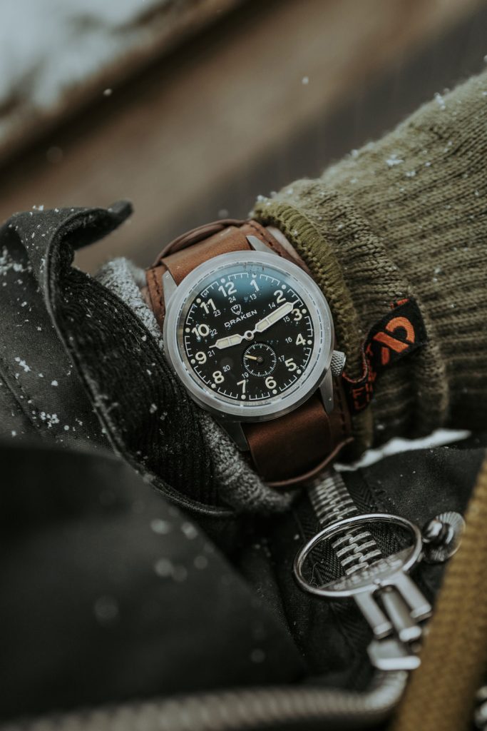
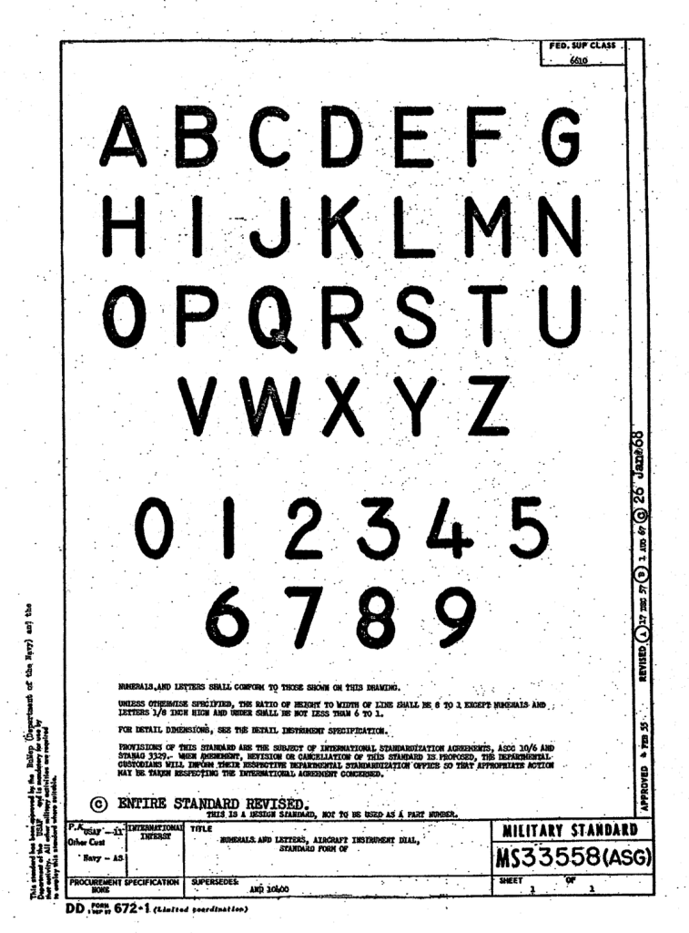
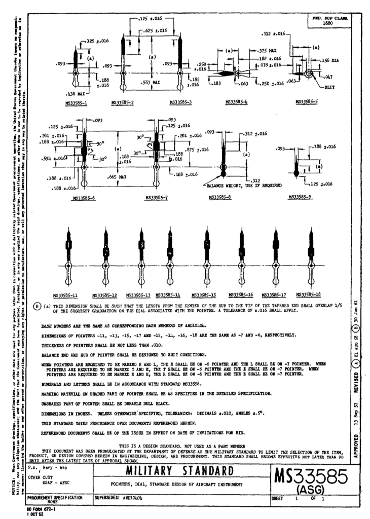
Inspiration for the last design came from another favourite source – aviation instruments. I noticed that many analogue cockpit dials used a particular font. It was rounded, simplified and had very specific shapes for the 1 and 3 numerals. Digging deeper I found the original military standard font (MS33558) from 1968 . I followed the hand design from the 1969 accelerometer spec sheet, which had uniform widths and differing heights. We simplified these further, removing the tails for a simple and clean design we now call Aoraki ‘Milspec’. Interestingly, while reading the Hodinkee article mentioned above, I discovered IWC also started using the MS33558 font on their descendant of the IWC ‘Dirty Dozen’ watch, the Mark series. Since the Mark XVI, the MS33558 font has been used, with it now appearing in most of their pilot watch collection. You can learn more about the IWC Mark series in this great article from Monochrome.
Please feel free to comment below if you have any thoughts or input. I would also love to hear from any South African collectors who have vintage SADF-issued watches. Please get in touch if you do.
Kia kaha.
Mike